Bruinwalk
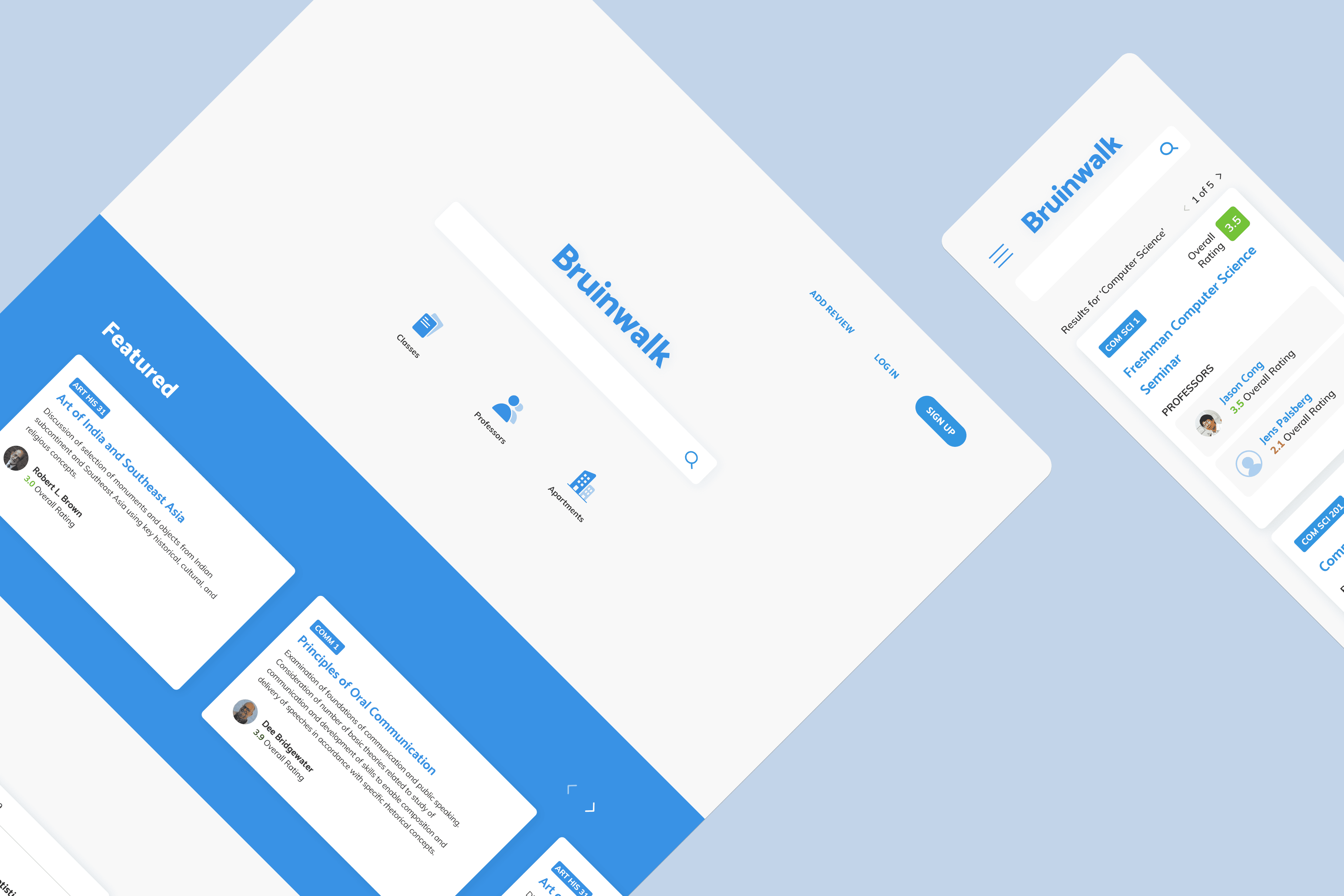
Redesigned and shipped UCLA's review platform
Overview
Role
Product Design
Design Strategy
Tools
Figma
G Suite
Pencil & Paper
Timeline
9 months
Team
Design: Nidhi Bhanu
Engineering: 9👥
Product: 2👥
Check it out →
Research
The problem: redesign Bruinwalk. Where to start?
Tasked with the vague goal of redesigning Bruinwalk, my co-designer, Nidhi, and I needed a plan. We decided to start with thorough initial research. Bruinwalk displays data from the UCLA registrar's office, supplemented by student reviews. Its main functions are adding reviews, searching, and browsing for classes and professors so we broke down these processes first.
What is Bruinwalk? Who are its users? How is it used?
Gathering Insights
Content above the first fold was ignored. Users did not write reviews.
We found that information above the first fold, comprising valuable real estate on each page, was confusing and overlooked. In addition, most users did not write reviews, which was not good, as reviews provide real experiences that bring quantitative data to life.
Data collected from Google Analytics indicated that usage spiked during enrollment periods, suggesting that Bruinwalk's main use case was browsing (shopping) for classes. Among survey respondents, most viewed ratings (84%), however, the metrics behind these ratings were unclear. Many looked for grade distributions (67%), displayed below the fold; on the contrary, few (6%) viewed tags, placed at the top.
How might we reduce friction to improve the usability of Bruinwalk?
While the main user flows were well-established and ranked relatively satisfactorily in usability by users, certain issues were made clear in our interviews. What are tags, and where is the data taken from? What do the numbers mean, in ratings? What happens when a professor is not already in the Bruinwalk database?
How might we create a more thoughtful, personalized experience?
Bruinwalk was mostly being used as a search engine, but it has the potential to be so much more. There is value to be leveraged in the influx of class data and shared experiences. How might we provide users the tools needed to filter through content? Since log-in is required, could we add recommended classes, show past reviews, and enable users to find what's most helpful?
How might we clarify the review process and incentivize users to regularly add reviews?
Users rarely added reviews and those who submitted missed entire sections of the form, resulting in sparse aggregate review data for viewing. Why are users confused about their anonymity? How might we make reviews more accessible?
Wireframing
Ideating scannability → saving time and headache during enrollment.
After a quick paper sketch confirming our visions, we each worked on wireframes independently, meeting twice a week to align on ideas and identify new goals. I played around with ways to display data in my iterations of the five main pages we identified. We chose to design desktop-first because it had the highest traffic.
I decided to display grade distributions alongside student ratings at the top of the page for optimal accessibility—our research showed that users looked for these pieces first. I also thought that using cards to organize information would help visualize groups and reduce cognitive overload amidst frankly, a lot of data.
Early Testing
Ratings: highly sought, highly misunderstood.
We conducted user testing on iterations of ratings with sliders, along with color, emoji, and text feedback.
Our final design settled on a simple radio button scale with feedback (expressions and text). Multiple forms of feedback and explanatory text ensure a consistent understanding of ratings without being cognitively overwhelming.
Working closely with our engineers during our design process helped us to consider edge case interaction patterns we had overlooked. After a couple of quarters of development and testing, we handed off! Let's return to our HMW questions.
Final Designs
Bruinwalk, reimagined. ✨
How might we reduce friction to improve the usability of Bruinwalk?
How might we create a more thoughtful, personalized experience for users?
How might we clarify the review process and incentivize users to regularly add reviews?
Homepage
Search
Course Page
Dashboard
Review
Impact
What changed?
During user testing of the prototypes we created, we found that users found their classes and professors quickly and enjoyed the updated review process. A post-launch usability test on 15 users in 2022 found a 93% SUS.
My end-to-end redesign left behind
A refreshed visual identity — componentized design system
Improved usability — clarified rating metrics
Improved information hierarchy — changes to the way highly sought information was displayed and collected
Personalization — dashboard, filters, recommendations
The foundation we built resulted in a more engaging and informative experience for UCLA students while generating revenue for UCLA's student publication. While it addressed key pain points, there is still much to be expanded upon. I am excited to see future designers build upon this foundation and adapt Bruinwalk to future generations.


